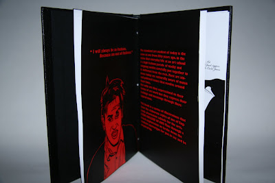
 Student Stereo has been made. Its a celebration of fashion around LCA. I have concentrated on working as a freelance illustrator/bookmaker for this and have broken my fine art principles in making it.
the statement goes as follows,
My idea is to drive away from the traditional style of oil Painting and drawing that produce in my fine art pieces and start to work as an illustrator for a client.
I came up with the idea that LCA has asked me to produce an illustrated book celebrating the fashion of the students. The challenge is not to look at it in a surreal way, but to walk away from being meaningful and literally just illustrate the fashion we see down the corridors.
Doing the work.
Doing the illustrations was the easy part, but finding the subjects wasn’t so. I walked down the corridors on countless days asking students for there photo graphs but all I got was weird looks. It was a field exercise in which I didn’t have time to waste, I understand that in an industry you need to get the resources quick… so I had to ask people I no. I then went out into the streets of Leeds to take photos of passers buy; this was so I could understand other fashions and use it as a reference to choose the final student images. Using comparative ideas and optimism I selected the subject in which I was to draw from.
I printed a photo montage to stick on my wall behind my computer to use as a formal point of reference. When drawing the illustrations I went down to the basics of fine art, using the formal elements and abstract mapping to draw, the images are built up of layers, in a sequence very similar to the way I use oils and acrylics on canvas.
I banned myself from looking at any other artists work, this was so I had an empty mind and the work was my own imagination combined with the photographs. This is something I usually do, thus the work is mine and not just a reproduction of someone else’s styles.
The book layout was simple. Instead of using the grid system most graphic designers use I looked at what I no, the golden rule of composition (see reference). This was to create an order of chaos, the very same order Jackson Pollock illustrates in his drip paintings. This for me worked. I have to admit, typography isn’t a strong focal point in my work, I'm more focused on humans, and images speaking for themselves so the type’s used where selected because I felt (and dare I admit to saying this) they looked nice with my work. Not much constructiveness going on but I did have a play around with typefaces and created my student stereo logo which does have a strong impact, I kept it simple; the book is about the illustrations and idea. Albect Durer stated that ‘god is in the detail. Less is more’ which in most of my compositions is a rule I follow.
I did not want to spoil the aesthetics of the book buy creating a dust cover, to me the impact of the student stereo font followed by the illustrations is enough and a cover might over throw what is inside. People might not want to pick it up if the cover was second class. I also believe that the book being in black and plain almost invites you in, humans are interested into the unknown, and having no image or title on the outside makes it mysterious next to books with covers. Almost like that tin can in your cupboard with no label, you wonder what is in it; it takes over your dreams and then one day... you give in to the temptation and open it (warholian presence in consumerism and the idea of art being an advert).


